This is it…Day #1 of Love Equity. But what is Love Equity? It’s the tangible and intangible value you add to your home and life when you incorporate the things you love. It’s about projects. It’s about inspiration. It’s about being happy where you’re at. What can you expect to find here? I love kitchens (who doesn’t?) so you’ll see lots of posts in the kitchen. Some large-scale renovations–with smaller takeaway ideas, quick updates like countertops and backsplashes, small accessory type projects for all over the house, storage ideas, great living spaces, exterior projects, do-it-yourself tips, sweet products…you get the idea. Like a renovation/lifestyle magazine with cool ideas and photos, but it’s free.
Today, I’m kicking it off with my favorite recent project–my sister Sharon’s kitchen renovation. It was a big project in a small space. But it’s not just about pretty finishes. It incorporates lots of great space maximizing ideas that make a small kitchen and house–live large! Check it out.
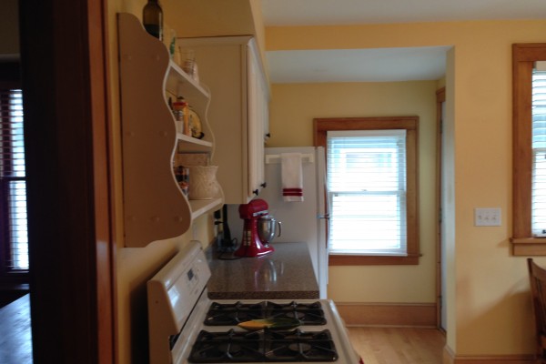
Sharon’s original kitchen was cheery but the big problem was that it was closed off from the rest of the house. Plus, the dropped ceiling and soffits made it seem even smaller and more confined.
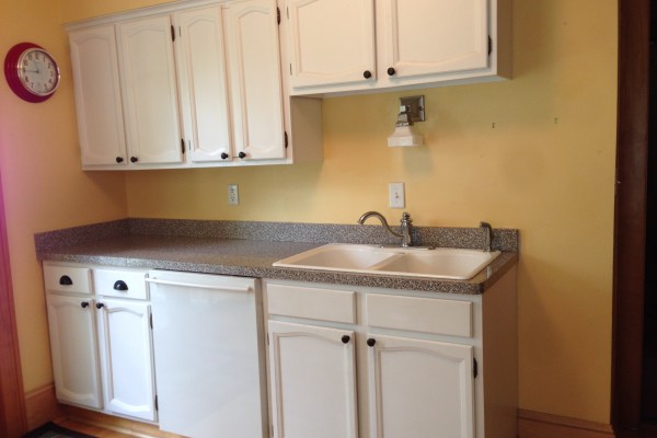
The cabinets looked okay, but were lightweight particle board updated with white paint. The house is from 1919 but the kitchen was remodeled in the late 1980s. They added the soffits and lowered the ceiling to accommodate these stock cabinets. Going modern! There was a shelf instead of an exhaust vent which was a real bummer.
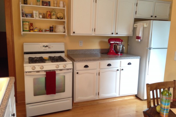
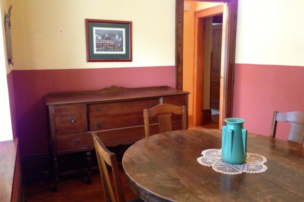
The adjacent dining room felt cramped and was unused. Basically it was a walk-through to the kitchen.
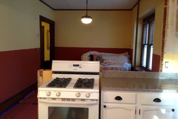
The original plan was to just open up the wall behind the range and create a peninsula to join the kitchen to the dining room–keeping everything else intact.
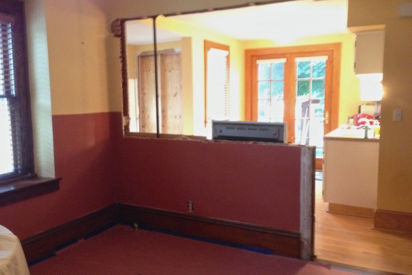
But, as soon as the wall was opened up, Sharon realized…it’s now or never. She really wanted to swap the positions of the range and the sink. She also wanted to take out the soffits and raise the ceiling to nine feet–the same height as the ceilings in the rest of the house. At that point she learned the most expensive six words in home renovation: As long as we’re at it. But she never looked back.
Together with our sister Andrea, we sketched out the plan. Andrea is a DIY all-star. She completely renovated her 1912 house and has more tools, ladders and know-how than nearly anyone I know. So we were the team. We spent a lot of time with the plan. The appliance placement was pretty obvious. Then, we assigned a purpose to every cabinet: garbage and recycle, dinner plates, pots and pans, dish towels, mixer, utensils, etc. This is critical planning. You don’t want to wind up with a kitchen full of pretty cabinets and then try to figure out where to put your stuff.
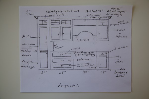
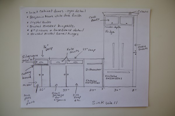
Guided by our sketches, custom cabinetmaker Paul Lorentz from Behnke Woodworking created the cabinet plan–and cabinets. (He came out and took meticulous measurements for an exact fit.) In this kitchen, every single inch needed to be maximized, so custom cabinets were a must. The made-to-order pieces give the kitchen a personality to love–and all of the other selections were made based on the cabinets. The goal was to maintain the original character of the house but give it 21st century livability.
What’s to love about the cabinets?
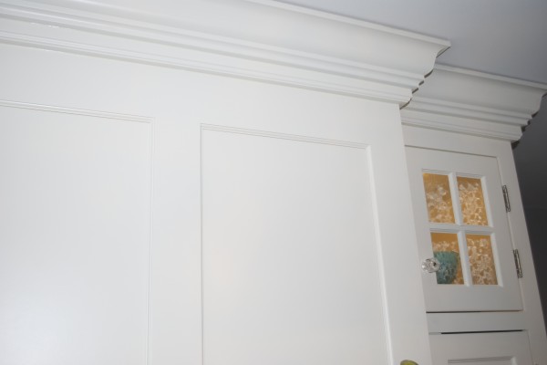
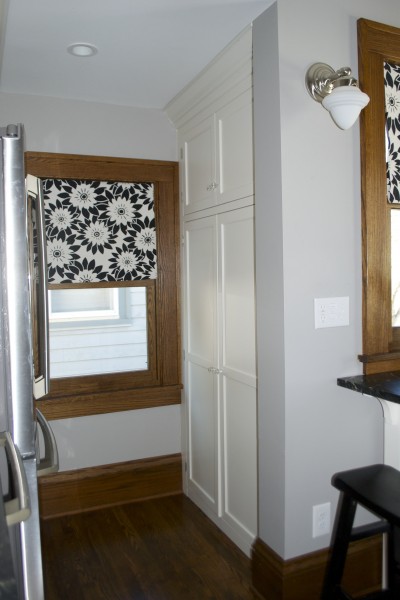
*Extra tall cabinets: The new white inset door cabinets soar all the way to the nine-foot-high ceiling. Plus, six-inch crown molding makes a beautiful finish.
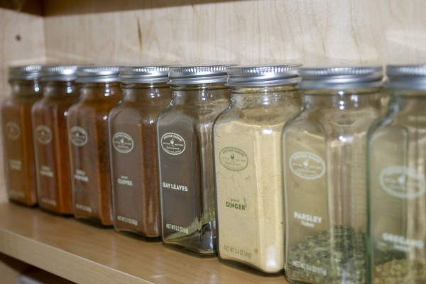
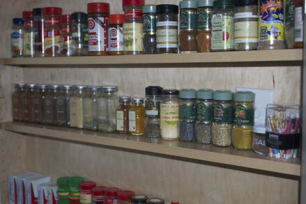
*A spice pantry: We reclaimed this five-inch deep space for a floor to ceiling spice pantry. We were a little unsure about it in the design phase and even considered a chalkboard wall here instead, but it turned out to be a kitchen fave.
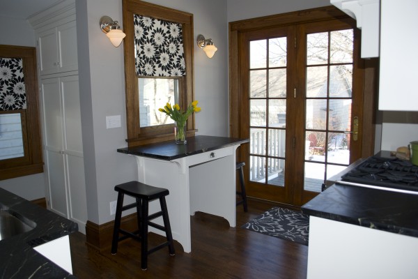
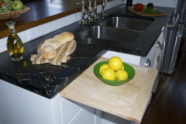
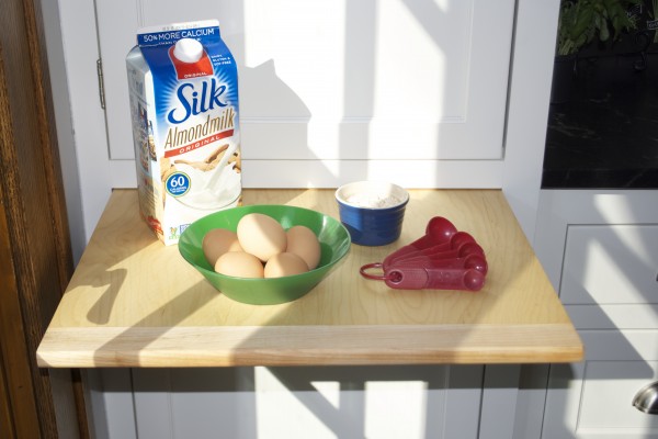
*Counter space on demand: We cut back the cabinet to the left of the sink to 16 inches, instead of the standard 24 inches. This creates a comfortable walkway into the kitchen.
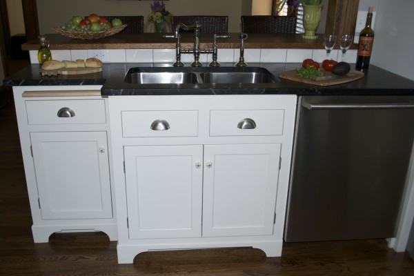
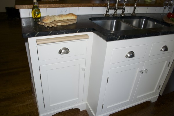
By adding a cutting board, it gives countertop space on demand.
*A multi-purpose pantry: A large, floor to ceiling pantry…
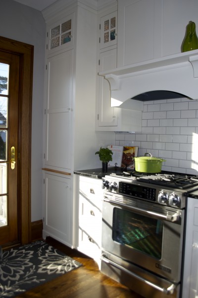
…hides the microwave…
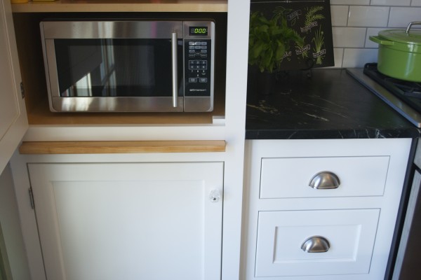
…and also has another sweet cutting board. More countertop on demand–a big deal for a space challenged kitchen.
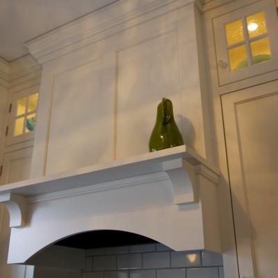
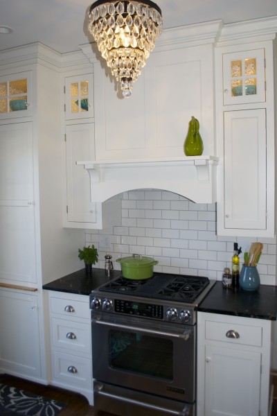
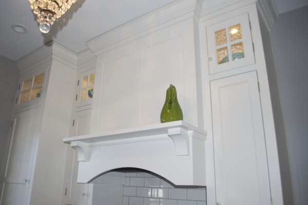
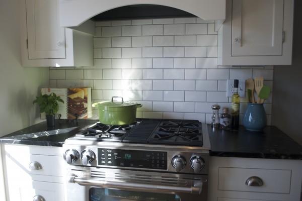
*Focal point: A perfectly proportioned range hood hides a much needed exhaust vent and gives the kitchen a beautiful focal point.

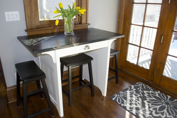
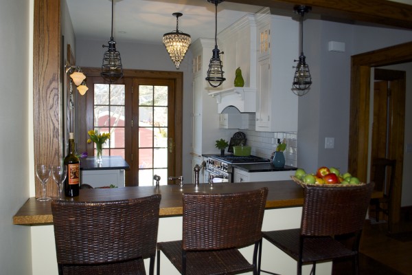
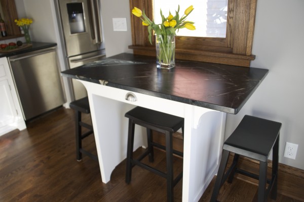
*Flexible island: The new island is counter height so it provides additional workspace–or a perfect spot to sit. We considered closing in the island base for added storage but felt leaving it open would give a more airy feel to the kitchen and provide an extra place to stash a stool.
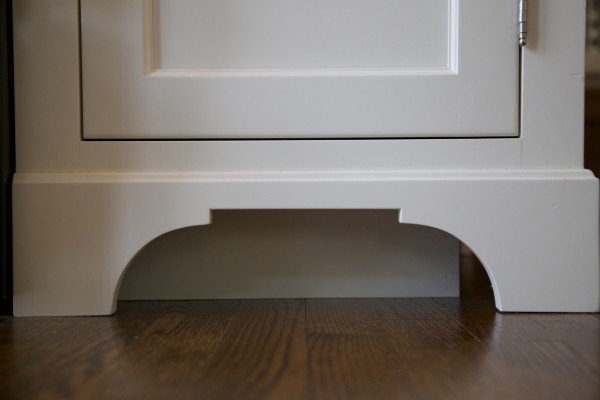
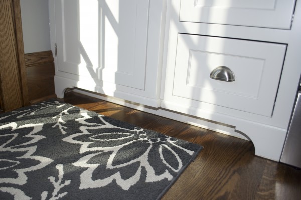
*Sweet details: The baseboard detail isn’t necessary, but it’s SO pretty…
…and seeded glass cabinet doors with puck lights finish off the cabinets with a little drama.
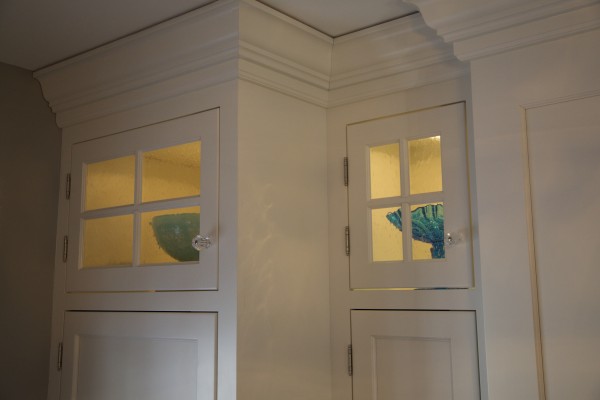
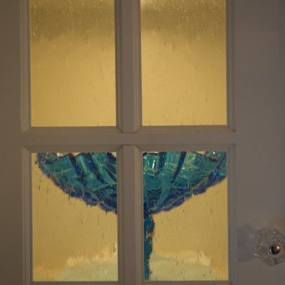
Beyond the cabinets, there’s plenty to love…
Soapstone: Soapstone countertops warm up the kitchen and fit the era of the house. Keeping the countertop material consistent throughout the space makes the kitchen feel larger.
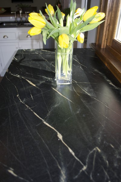
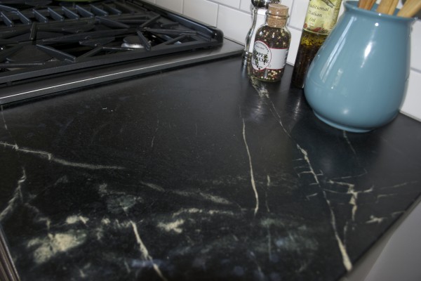
Floors: New red oak floors in the kitchen were finished to match those in the rest of the house. The match makes the kitchen floor feel original and unifies the entire main floor.
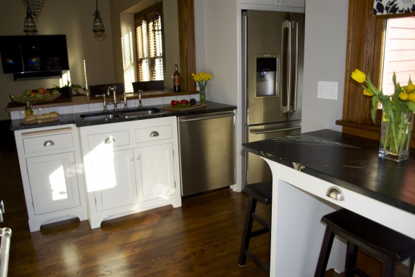
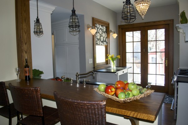
Wood peninsula: A red oak bar top makes a great transition from the new kitchen to the existing dining room.
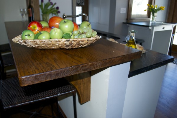
Millwork: More red oak trim for the windows and baseboard tie into the rest of the house.
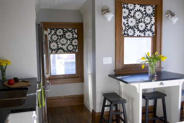
Lighting: When the ceiling and walls were opened up, we were able to upgrade the lighting and electrical. I love the mix of layered lighting. You can change the mood of the room, depending on which lights you turn on. We went with varied finishes on the fixtures for a “collected” feel.
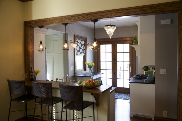
Recessed lights: Recessed cans flood the kitchen with light and are the main source of ambient light in the space.
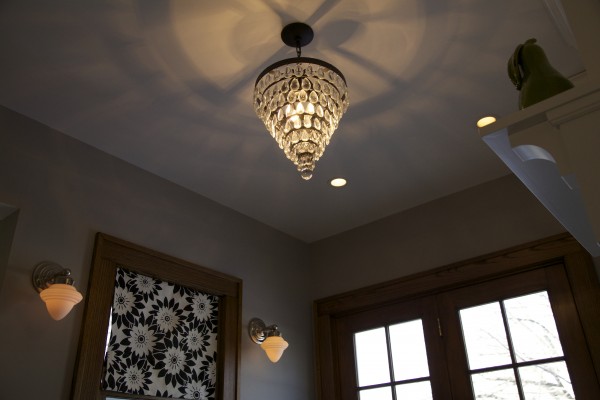
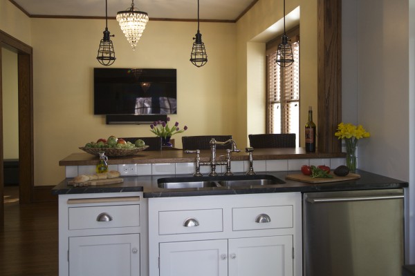
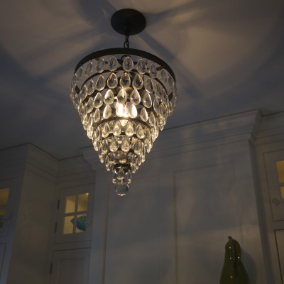
Crystal chandeliers: Cone shaped crystal chandeliers add just a little glitz without going over the top. Carrying the same chandelier from the kitchen into the dining area ties the spaces together.
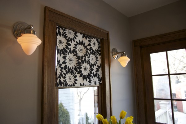
Sconces: Simple schoolhouse style sconces highlight the island area. They add a little extra light and interest to the space.
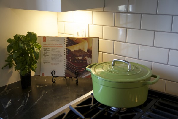
Under cabinet lighting: Adding lights under the cabinets illuminates the workspace. We had our electrician hardwire them in but if you want to add them to an existing kitchen, they’re simple to install and can be plugged in, eliminating the need for an electrician.
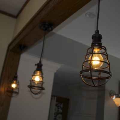
Pendant lights: Aged bronze cage pendant lights keep the sight lines open between the two spaces and add a fun old-world bridge between the rooms.
Accent lights: Puck lights in the glass door cabinets draw your eye up to finish off the lighting plan with a little icing on the cake.
Multi-Media: While we had the electrician here….we had him hook us up with power for a TV. Now there’s no reason to leave this space!
So what does Sharon think of her new kitchen? She just keeps saying, “I love it. I can’t believe it’s my house. I feel like I moved.” Why? The new space gives her the best of both worlds–traditional style with a modern floor plan. A small kitchen living large!
That’s all for today. Thanks for stopping by. I hope you’ll check back soon!
MK
Ready to build this kitchen? Follow the links below:
- Behnke Woodworking: White inset door cabinets
- Benjamin Moore White Dove finish
- Crystal chandelier pendant lights: Lowes Allen + Roth 12.76 inch with oil rubbed bronze pendant light with crystal shade
- Sconces: Lamps Plus – Bradford 11” high schoolhouse wall sconces
- Peninsula Pendants: Aged bronze cage pendant lights
- Under Cabinet Lights
- Sink: Blanco Spex Plus undermount stainless sink
- Faucet: Rohl A1258LMWSPN-2 Polished Nickel Country Kitchen Faucet
- Window Fabric: HGTV Home Upholstery Fabric Pop Art Onyx
- Wood Floor: Dave’s Floor Sanding, Red oak – Water popped with golden stain
- Paint: Benjamin Moore Ozark Shadows AC 26
- Refrigerator: Electrolux Counter-Depth French Door Refrigerator with Wave Touch Controls
- Dishwasher: Electrolux Built-in Dishwasher with IQ-Touch Controls
- Range: Jenn-Air Slide-in 30″ Dual Fuel Range with Convection
Share This:
